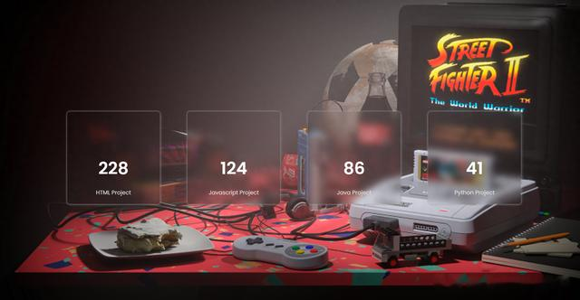
一、响应式计数器
效果:
源代码:
<!DOCTYPE html><html lang="en"> <head> <meta charset="utf-8"> <meta name="viewport" content="width=device-width, initial-scale=1.0" /> <title>海拥 | 计数器动画</title> <link rel="icon" href="https://haiyong.site/img/favicon.png" sizes="192x192" /> <link rel="stylesheet" href="https://cdnjs.cloudflare.com/ajax/libs/font-awesome/6.0.0-beta2/css/all.min.css" /> <link href="https://fonts.googleapis.com/css2?family=Poppins:wght@400;600&display=swap" rel="stylesheet" /> <style media="screen"> * {padding: 0;margin: 0;box-sizing: border-box;font-family: "Poppins", sans-serif;}body {background: url("https://img-blog.csdnimg.cn/aff605fb499846f5911bec368762e829.png" );background-repeat: no-repeat;background-position: center;background-size: cover;height: 100vh;}.wrapper {position: absolute;width: 80vw;transform: translate(-50%, -50%);top: 50%;left: 50%;display: flex;justify-content: space-around;gap: 10px;}.container {width: 28vmin;height: 28vmin;display: flex;flex-direction: column;justify-content: space-around;padding: 1em 0;position: relative;font-size: 16px;border-radius: 0.5em; backdrop-filter: blur(10px);box-shadow: -1px -1px 4px #aaa9a9a2, 1px 1px 7px rgba(147, 149, 151, 0.671);}i {color: #42f9e8;font-size: 3.8em;text-align: center;}span.num {color: #ffffff;display: grid;place-items: center;font-weight: 600;font-size: 3em;}span.text {color: #e0e0e0;font-size: 1em;text-align: center;pad: 0.7em 0;font-weight: 400;line-height: 0;}@media screen and (max-width: 1024px) {.wrapper { width: 85vw;}.container { height: 26vmin; width: 26vmin; font-size: 12px;}}@media screen and (max-width: 768px) {.wrapper { width: 90vw; flex-wrap: wrap; gap: 30px;}.container { width: calc(50% - 40px); height: 30vmin; margin-bottom: 25px; font-size: 14px;}}@media screen and (max-width: 480px) {.wrapper { gap: 15px;}.container { width: 100%; height: 25vmin; font-size: 8px; margin-bottom: 25px;}}.page-footer { position: fixed; right: 35px; bottom: 20px; display: flex; align-items: center; padding: 5px; color: black; background: rgba(255, 255, 255, 0.65);}.page-footer a { display: flex; margin-left: 4px;}.touxiang{ bottom: 0px; width:30px; height:30px;} </style> <script> var _hmt = _hmt || []; (function() { var hm = document.createElement("script"); hm.src = "https://hm.baidu.com/hm.js?a9430a37066911650e26adadcc42798a"; var s = document.getElementsByTagName("script")[0]; s.parentNode.insertBefore(hm, s); })(); </script> </head> <body> <div>二、简单时钟模拟效果:
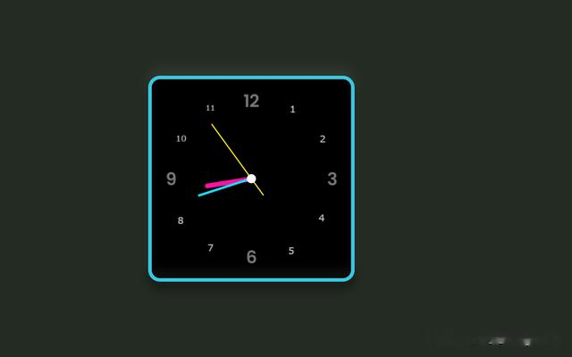
源代码:
<html lang="en"><head> <meta charset="UTF-8"> <meta name="viewport" content="width=device-width, initial-scale=1.0"> <meta http-equiv="X-UA-Compatible" content="ie=edge"> <title>模拟时钟⏰</title> <meta name="viewport" content="width=device-width,initial-scale=1.0,maximum-scale=1.0,minimum-scale=1.0,user-scalable=0"> <meta name="keywords" content="动画" /> <link rel="icon" href="https://haiyong.site/img/favicon.png" sizes="192x192" /> <style>*{ margin: 0; padding: 0; box-sizing: border-box;}body{ display: flex; justify-content: center; align-items: center; min-height: 100vh; background: hsl(113, 12%, 15%);} .Clock{ width: 350px; height: 350px; display: flex; justify-content: center; align-items: center; background: url(https://dev-to-uploads.s3.amazonaws.com/uploads/articles/sa5ueuzzu2l7j8iv7bk8.jpg); background-size: cover; border: 6px solid #3ac7e0; border-radius: 20px; box-shadow: 0 -15px 15px rgba(255,255,255,0.05), inset 0 -15px 15px rgba(255,255,255,0.05), 0 15px 15px rgba(0,0,0,0.3), inset 0 15px 15px rgba(0,0,0,0.3);}.Clock:before{ content: ''; position: absolute; width: 15px; height: 15px; background: #fff; border-radius: 50%; z-index: 10000;}.Clock .hour,.Clock .minute,.Clock .second{ position: absolute;}.Clock .hour, .hr{ width: 160px; height: 160px;}.Clock .minute, .min{ width: 190px; height: 190px;}.Clock .second, .sec{ width: 230px; height: 230px;}.hr, .min, .sec{ display: flex; justify-content: center; /*align-items: center;*/ position: absolute; border-radius: 50%; }.hr:before{ content: ''; position: absolute; width: 8px; height: 80px; background: #ff10a3; z-index: 10; border-radius: 6px 6px 0 0;}.min:before{ content: ''; position: absolute; width: 4px; height: 90px; background: rgb(26, 219, 245); z-index: 11; border-radius: 6px 6px 0 0;}.sec:before{ content: ''; position: absolute; width: 2px; height: 150px; background: rgb(248, 233, 15); z-index: 12; border-radius: 6px 6px 0 0;} </style> <script> var _hmt = _hmt || []; (function() { var hm = document.createElement("script"); hm.src = "https://hm.baidu.com/hm.js?a9430a37066911650e26adadcc42798a"; var s = document.getElementsByTagName("script")[0]; s.parentNode.insertBefore(hm, s); })(); </script></head><body> <div></div> </div> </div> <script> const deg = 6; const hr = document.querySelector('#hr'); const min = document.querySelector('#min'); const sec = document.querySelector('#sec'); setInterval(() => { let day = new Date(); let hh = day.getHours() * 30; let mm = day.getMinutes() * deg; let ss = day.getSeconds() * deg; hr.style.transform = `rotateZ(${(hh)+(mm/12)}deg)`; min.style.transform = `rotateZ(${mm}deg)`; sec.style.transform = `rotateZ(${ss}deg)`; }) </script></body></html>