Python因为其语法简单、胶水语言的特性,诞生了很多好用的轮子(标准库、第三方库),也因此让Python一度成为了最热门的编程语言(2023年1-10月 TIOBE编程语言排名第一)。
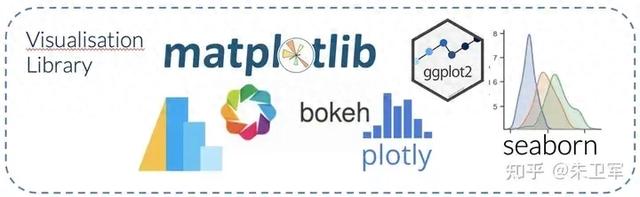
我用过很多Python库,因为数据分析展示的需要,经常用一些可视化库来设计图表,这些库有不同的应用场景,生产力非常强大。
基础可视化:Matplotlib、Seaborn、Altair
交互可视化:Bokeh、plotly
地图可视化:Cartopy、Folium
Web可视化:Dash
BI可视化:Superset
流程图可视化:PyGraphviz
下面详细介绍下常见的5个可视化库:Matplotlib、Seaborn、Altair、Bokeh、plotly
1. MatplotlibMatplotlib不必多说,它是最流行的Python可视化库,可以绘制二维、三维、动态、交互等任何图表,也是Seaborn等众多可视化库的底层依赖。
学习文档:https://matplotlib.org/
Matplotlib的特点是图表功能齐全,可定制化强,一般专业的新闻图表、科研图表、出版图表、企业图表都可以用Matplotlib绘制。
唯一的缺点是高级封装不多,绘图代码稍显复杂。
 import matplotlib.pyplot as pltdata = {'apple': 10, 'orange': 15, 'lemon': 5, 'lime': 20}names = list(data.keys())values = list(data.values())fig, axs = plt.subplots(1, 3, figsize=(9, 3), sharey=True)axs[0].bar(names, values)axs[1].scatter(names, values)axs[2].plot(names, values)fig.suptitle('Categorical Plotting')
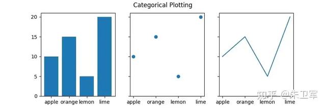 2. Seaborn
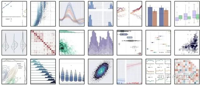
Seaborn是在Matplotlib基础上经过高级封装的可视化库,一般用于统计分析,是数据科学领域的核心可视化库,类似于kaggle这种数据比赛大部分都用Seaborn。
解释下高级封装,所谓封装就是把很多图表的功能模块化,拿来即用,不需要你写很多代码实现。
比如说Seaborn可以一行代码设置图表的配色风格,什么统计风、商务风、学术风,都给你搭配的妥妥的,还有像置信区间这种专业领域的图表也集成到函数中。
学习文档:https://seaborn.pydata.org/
另外Seaborn与Pandas、Numpy集成的非常好,可以轻松使用Series、DataFrame、array数据类型进行图表开发,相较于Matplotlib节省了很多数据处理的时间,让你更加专注于制图。
示例:
import seaborn as snssns.set_theme(style="darkgrid")tips = sns.load_dataset("tips")g = sns.jointplot(x="total_bill", y="tip", data=tips, kind="reg", truncate=False, xlim=(0, 60), ylim=(0, 12), color="m", height=7)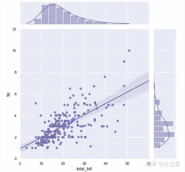 3. Altair
Altair也是Python中一个主打统计分析的可视化库,它和Seaborn不同的是,语法会更加简洁,让你在可视化的过程中去分析梳理数据。
Altair基于Vega-Lite语法规则,将可视化描述为从数据到图形标记(例如,圆圈、矩形或折线)和属性(例如,颜色、大小、形状或透明度)的编码映射过程,使用Json格式规范图表外观,使用起来非常简单。
学习文档:https://altair-viz.github.io/
示例代码
import altair as altfrom vega_datasets import datasource = data.iris()alt.Chart(source).mark_circle().encode( alt.X('sepalLength').scale(zero=False), alt.Y('sepalWidth').scale(zero=False, padding=1), color='species', size='petalWidth')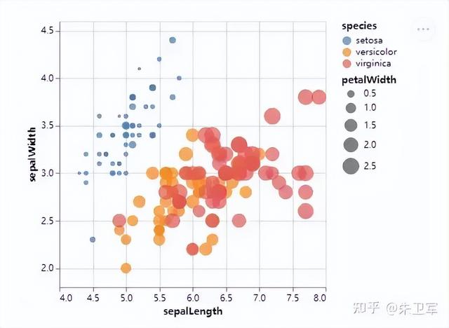 4. Bokeh
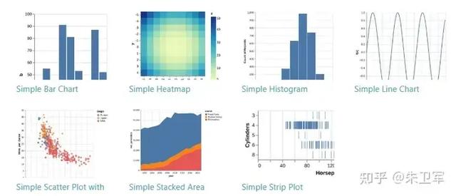
Bokeh主打web交互式可视化,图表不再是冷冰冰的图片,而是可以随意去调整的可视化交互工具,比如创建看板、应用、网页,都可以轻松实现,你也可以在jupyter notebook上去展示Bokeh图表。
Bokeh有很多的交互工具,比如缩放、平移、框选、悬停、重置、编辑、图像导出等等,使用起来非常方便。
学习文档:https://docs.bokeh.org/
 搭建可视化应用
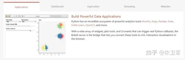 搭建看板
搭建看板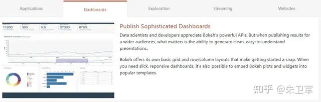 Jupyter notebook数据可视化探索
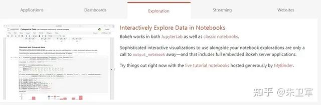 数据流分析
数据流分析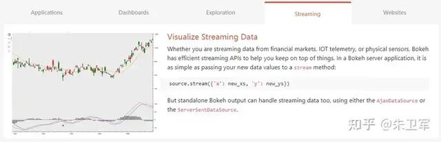 web网页
web网页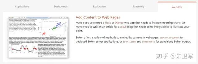
示例代码
import numpy as npimport pandas as pdfrom bokeh.palettes import tolfrom bokeh.plotting import figure, showN = 10df = pd.DataFrame(np.random.randint(10, 100, size=(15, N))).add_prefix('y')p = figure(x_range=(0, len(df)-1), y_range=(0, 800))p.grid.minor_grid_line_color = '#eeeeee'names = [f"y{i}" for i in range(N)]p.varea_stack(stackers=names, x='index', color=tol['Sunset'][N], legend_label=names, source=df)p.legend.orientation = "horizontal"p.legend.background_fill_color = "#fafafa"show(p)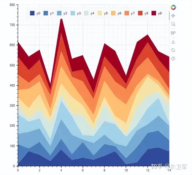 5. plotly
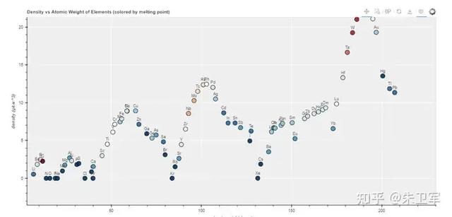
plotly.js是非常出名的交互式可视化工具,它有Python的第三方接口,也就是plotly库。
plotly图表类型比较丰富,比如折线图、散点图、面积图、条形图、误差条、方框图、直方图、热图、子图、多轴图、极坐标图、气泡图、地图等等,这些都集成好固定的函数用法,可以拿来即用。
plotly绘制的图表相对比较美观,适合商用展示,且它的图表可以基于web,能进行多元化的交互操作。
其次plotly可定制化也非常强,类似于matplotlib,你可以对图表做任何细节的修改。
学习文档:https://plotly.com/python/
示例代码
import plotly.graph_objects as go import numpy as np # Data to be plotted x = np.outer(np.linspace(-2, 2, 30), np.ones(30)) y = x.copy().T z = np.cos(x ** 2 + y ** 2) # plotting the figure fig = go.Figure(data=[go.Surface(x=x, y=y, z=z)]) fig.show() 小结
小结上述的5个Python可视化库都是比较常见的,几乎能实现你大部分需求,还有一些垂直类的需求需要专门的库来实现,比如BI、地图等等,这个后面慢慢分享。
