体育建筑 健身中心
本项目的灵感来源于一个简单的想法——为了激发人们的思维,提供一种超越身体健康的体验。设计者在本项目中遵循了两个原则:标志性设计和试图打造令人难忘的健身场地,他们有意识地摆脱传统健身中心的样貌进行设计。通过对健身心理学、用户行为和场地的详细分析和广泛的研究,他们在这栋建筑中安排了一系列体验项目,激发客户迈向更加健康的明天。
The story of Physiofit starts from a simple idea – to invigorate peoples’ minds and craft an experience beyond physical fitness. We approached this design with two guiding principles: to be iconic and unforgettable and to consciously drift away from the expected aesthetic of a fitness centre. After extensive research about fitness psychology, user behaviour, and detailed site analysis, this project is a curation of experiences that motivates its visitors towards fitter tomorrow.
▼项目俯瞰,Aero view of the project© Umang Shah Photography

▼顶视图,Overlooking the building© Umang Shah Photography

项目场地的南侧和西侧毗邻一片美丽的辣木种植园,东侧是主要道路,北侧紧邻一栋教育建筑,以上组成了本项目的周边环境。场地中主要设置了两个部分——健身房和理疗区。健身房中有三个健身区、一个团体健身工作室、CrossFit区和运动草坪区。理疗区设置了专门矫形和神经康复室,还有供长期康复的房间。除此之外,建筑中还设有两个接待处、行政办公室、化学用品区和肌肉恢复设施区,能够满足健身用户和理疗用户的各类需求。对于建筑部分的设计是需要将其在纵向上分成两个部分。
▼轴测分析图,Exterior Isometric© Dhulia Architecture Design

The site adjoins the beautiful moringa plantations on the south and west, arterial roads on the east, and educational buildings on the north, which form the immediate context. The programmatic brief includes two main sections – Gym and Physiotherapy. The gym has three Fitness Zones, a Group Exercise Studio, CrossFit and Sports Turf. The physiotherapy section has specialized ortho and neuro rehabilitation areas, alongside long-stay rooms for extended recovery. Two receptions, administrative offices, cosmetics area, and muscle recovery facilities cater to the needs of both gym and physiotherapy clients. The design approach and these requirements split the building vertically into two halves.
▼外观概览,Exterior© Umang Shah Photography

▼外观夜览,Night view© Umang Shah Photography


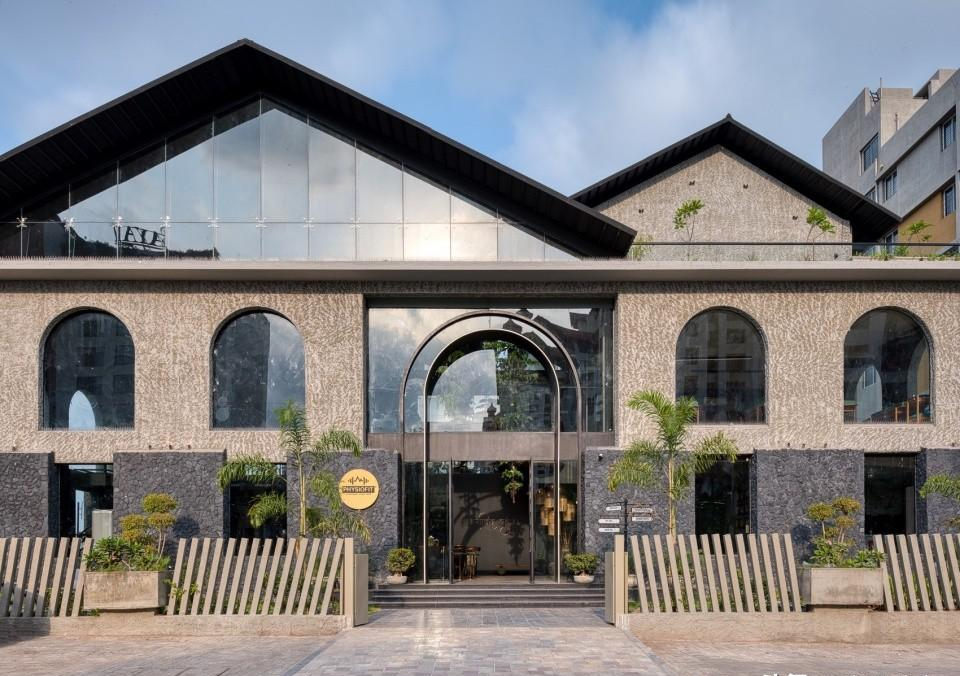
立面部分设计者将极简主义线条与微妙的古典元素进行了完美的融合,营造出一种亲和感和永恒感。他们利用不同材质创建了平衡的构图。建筑底部的石墙是当地石匠精心雕刻的Kadapa工艺,从底座开始,建筑从坚实的基座逐渐向更加轻盈的风格过渡。一层采用了原始的抹灰墙、拱形窗和巴黎材质。屋顶处仿照优美的山脉形状打造,轻轻的落在建筑之上。这栋建筑与周边环境形成了鲜明的对比。
▼体量分析图,Massing Drawings© Dhulia Architecture Design

The building’s facade seamlessly blends minimalist lines with subtleical elements, fostering a sense of relatability and permanence. The use of materials creates a balanced composition while breaking down the scale. The heavy stone-clad walls at the base bear an intricate chiselled Kadapa work by local masons. The building transitions from a solid base to a lighter, more skyward-reaching form. Level one features raw plastered walls, arched openings and glass. Above, the roof takes on the graceful form of a mountain range, settling gently upon the structure. The building presents a stark contrast with its context.
▼立面,Facade© Umang Shah Photography


▼入口处,Entrance© Umang Shah Photography

▼室外露台,Terrace© Umang Shah Photography

一天中随着时间的变化,外立面和室内呈现出不同的光影效果,为建筑增添了活力。底层的开窗和一层的拱形窗能够调整自然光线的照射量,同时形成不同的有趣光影效果。
▼前台分析图,Reception Narrative Diagrams© Dhulia Architecture Design

As the sun traverses the sky, the interplay of light and shadow across the facade and interiors adds another layer of dynamism to the building’s design. The deep openings on the ground floor and the arched openings on level one allow controlled sunlight while creating an interesting play of light and shadow.
▼前台接待处,Reception© Umang Shah Photography

▼接待处绿植,Greenery at the reception© Umang Shah Photography


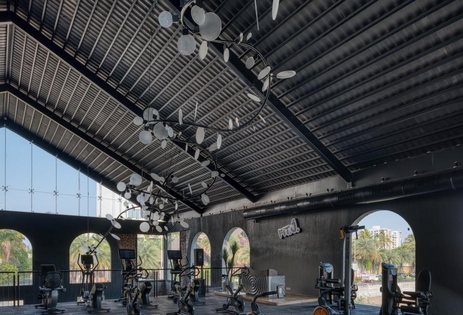
▼主要健身空间,Fitness space design© Umang Shah Photography


▼瑜伽室,Yoga space© Umang Shah Photography

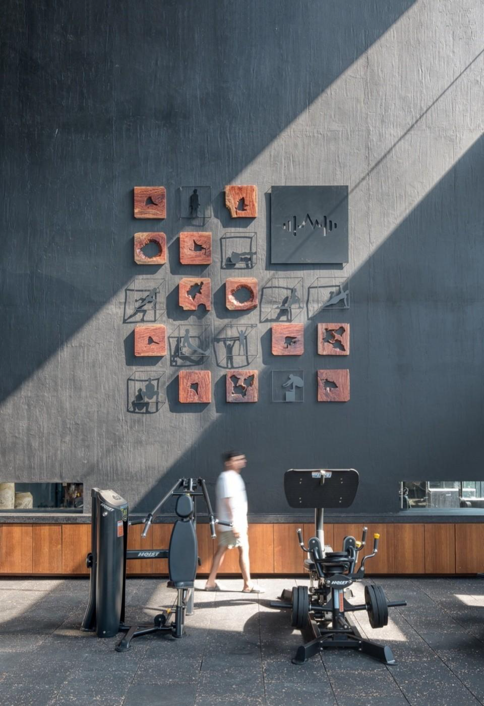
▼健身空间设计细部,Fitness space design details© Umang Shah Photography


建筑的结构和开窗框景辣木种植园为室内提供了完美的空间。“这是一个低语自然界美妙的空间:高达的针叶树林、小雨、雷暴、在岩石地形仰望星空。”这些景象能够唤起自然成长的感觉,并且设计者巧妙地将这些感觉融入了空间设计之中。
▼设计细节分析图,Narrative Diagrams© Dhulia Architecture Design


The architecture of the building and the openings framing the moringa plantation sets the perfect stage for a fascinating interior narrative to unfold. “Imagine a space that whispers treasures of the natural world: a night sky above tall coniferous trees and light rain, thunderstorms and rocky terrain, also a night where a galaxy of stars is visible.” This evokes a sense of nature and growth, skillfully translated into the space.
▼理疗室,Treatment room© Umang Shah Photography


▼办公室,Office© Umang Shah Photography


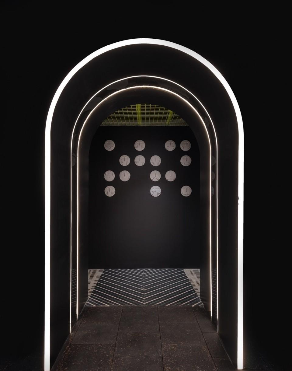
首层打造出了小雨的感觉,利用从屋顶垂下的针叶树作为灯光装置,一直延伸到接待处。办公室的天花板上有手绘的花卉图案,设计者还在天然的木质家具上雕刻了树枝和树叶的图案。Fit Zones1和2区域的设计也受到了流星雨和星光的启发打造了灯光装置。
The flooring on the ground floor depicts a light rain shower, while coniferous trees hanging from the roof are used as a light installation, extending into a thunderstorm light in the adjoining reception. The office ceilings have flower motifs handpainted with natural wood furniture with motifs of tree twigs and leaves inlaid. Similarly, Fit Zones One and Two have also designed light installations inspired by meteor showers and galaxies of light.
▼办公室设计细部,Office detials© Umang Shah Photography


▼走廊空间,corridor© Umang Shah Photography


▼卫生间,Toilet© Umang Shah Photography

本设计超越了典型的健身房形式,成为了一处恢复身心活力之所。精心打造了室内起到了激励和启发效果。建筑外部结构坚固耐用,呈现出了独特性。整个项目属于健身中心类设计的新方法,为客户提供了精心定制的体验,帮助他们更加有效的与建筑之间建立联系、增强归属感。
This project transcends the typical fitness experience, emerging as a sanctuary for physical and mental rejuvenation. The meticulously crafted interiors form a journey designed to motivate and inspire. While the exteriors stand strong, reflecting the uniqueness of the project. The entire design represents a new approach to fitness centres, offering carefully tailored experiences to help each user connect more effectively with the building and develop a stronger sense of belonging.
▼首层平面,Ground Floor© Dhulia Architecture Design

▼二层平面,First Floor© Dhulia Architecture Design

▼三层平面,Second Floor© Dhulia Architecture Design

▼剖面图,secion© Dhulia Architecture Design

▼浮盘细部,floating disc detail© Dhulia Architecture Design

