MORICO是位于胡志明市中心的一家咖啡馆和餐馆的翻新项目。现有建筑是一栋老式砖砌排屋,面宽5米,进深37米,朝向市中心的一条主要街道。周围许多商店都拥有朝向马路的玻璃幕墙,从而最大化利用空调覆盖的空间,但是也与城市脱节。在热带城市,随着街道越来越商业化,城市的深度也随之消失,人行道往往成为纯粹的通道。
MORICO is a renovation project for a café and restaurant located in the center of Ho Chi Minh City. The existing building is an old brick row house, 5 meters wide and 37 meters deep, facing a major downtown street. Many surrounding shops have glass walls facing the road to maximize air-conditioned space, which disconnects them from the city. In tropical cities, as streets become more commercialized, the depth of the city is lost, and sidewalks tend to become mere passageways.
▼店面,storefront© Paul Phan


在这个项目中,一个 “大洞”向熙熙攘攘的街道打开,作为商店的入口。通过把玻璃幕墙墙后退,沿人行道创造一个半公共空间,商店重新成为了城市的一部分。错落有致的植物提供了在室外“驻足”的区域,虽然它与街道相连,但作为一个平静的空间向后方延伸。这种做法很像越南的小巷在城市街区内创造聚集空间的方式。
▼立面示意,elevation concept© Inrestudio

In this project, a “big hole” opened onto the bustling street serves as the entrance to the shop. By recessing the glass wall and creating a semi-public space along the sidewalk, the shop reclaims its role as part of the city. Staggered plants provide areas to “stay” outside, and although it connects with the street, a calm space extends toward the back. This approach is similar to how Vietnamese alleys create gathering spaces within city blocks.
▼一个“大洞”向熙熙攘攘的街道打开,, a “big hole” opened onto the bustling street© Paul Phan


▼半公共空间,semi-public space© Paul Phan

半开放柜台Semi-Open Counter
开放式柜台厨房往往会在加强店铺与顾客之间互动的同时,限制店铺的功能性。在半开放式柜台中,上下体量错落布置,店员不必过分在意保持完美和整洁。他们在服务顾客的同时,也能轻松拿到自己需要的东西。
▼轴测图,axon© Inrestudio

Open counter kitchens often limit a shop’s functionality while enhancing interactions between the shop and its customers. In the semi-open counter kitchen, which features mismatched upper and lower volumes, the staff does not need to be overly concerned about maintaining perfect tidiness. They can easily reach what they need while engaging with customers.
▼半开放柜台,semi-open counter© Paul Phan

▼走廊座位,corridor dining area© Paul Phan

庭院和暖簾Courtyard and Noren
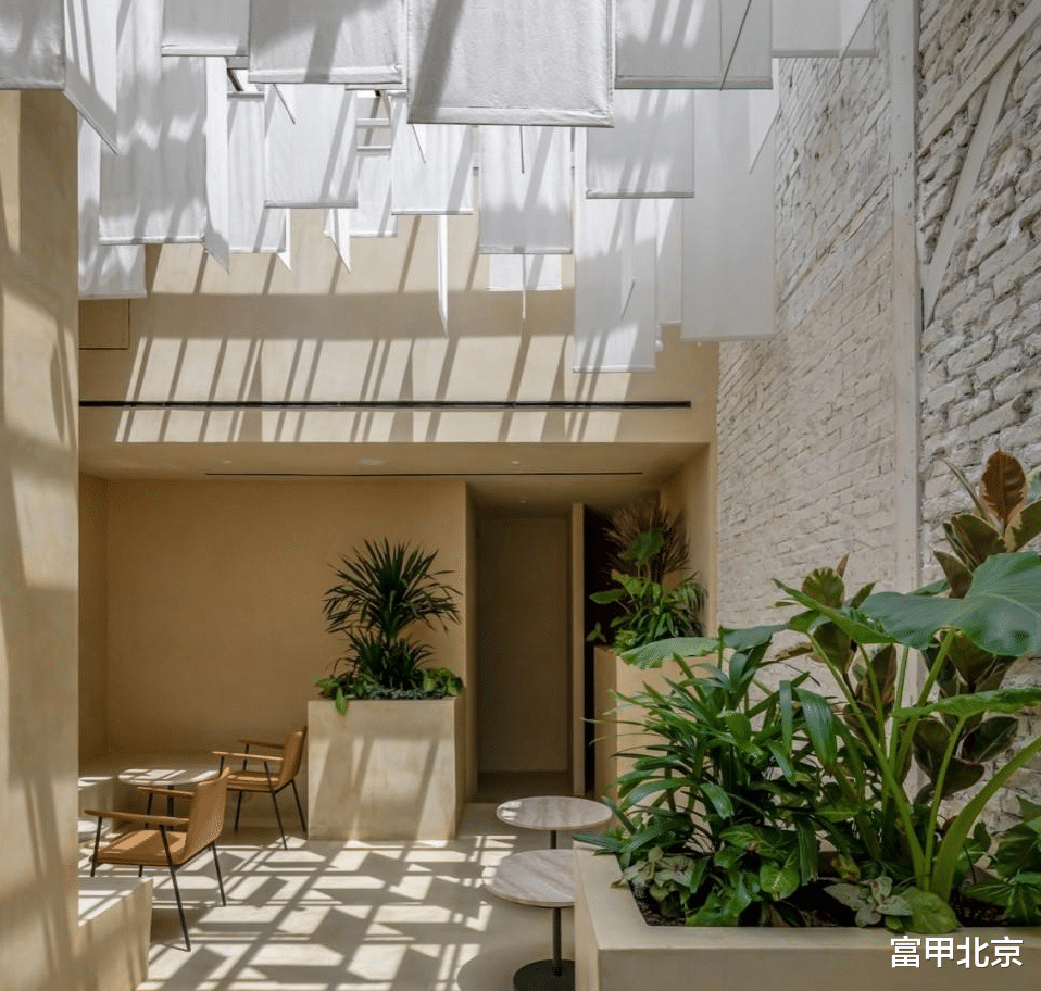
原建筑由一栋主屋和一栋独立房屋组成,中间是一个庭院。翻修前,这个庭院被两层地板和玻璃屋顶覆盖,作为一个过渡空间使用。通过恢复这个中庭,被幽深狭窄的房间吞噬的光线现在可以直达一层,为整个空间增添了氛围。在玻璃屋顶下,悬挂着180个暖簾窗帘,随着时间的推移,影子的图案也在不断变化。这种布置通过建筑形式体现了商店的“当代日本”的设计理念。
The original building consisted of a main house and a detached house, with a courtyard in between. Before the renovation, this courtyard area was covered with 2 layers of floors and a glass roof and served as a continuous space. By restoring the atrium, light that filters into the deep, narrow room now reaches the first floor, adding an accent to the space. Under the glass roof, 180 noren curtains are hung, and the patterns of shadows change over time. This setup represents the store’s “contemporary Japanese” concept in architectural form.
▼恢复的中庭,restored courtyard© Paul Phan


▼暖簾,noren curtain© Paul Phan

▼暖簾,noren curtain© Paul Phan


▼中庭夜景,courtyard night view© Paul Phan

新主屋New Main House
我们的设计旨在恢复翻新前失去的布局,同时保持空间的整体性。新的主屋位于二层,漂浮在地面之上,因此不会破坏一楼的连续性和休闲氛围。相反,位于二层的新主屋氛围宁静,适合顾客就餐。当大门关闭时,它可以作为一个大型包间,或者也可作为一个活动场所。
Our design aims to restore the composition lost before the renovation while maintaining the unity of the space. The new main house is positioned on the second floor, floating above the ground, so it does not disrupt the continuity and casual atmosphere of the first floor. Conversely, the new main house on the second floor has a serene atmosphere, making it suitable for dining customers. When the doors are closed, it can function as a large private room and is also expected to serve as an event venue.
▼二楼咖啡区,upper floor cafe area© Paul Phan


▼从二楼餐区望向中庭,courtyard viewing from dining area© Paul Phan

▼二楼餐区,upper floor dining area© Paul Phan


▼包间,private room© Paul Phan

▼店面夜景,exterior night view© Paul Phan

▼总平面图,site plan© Inrestudio

▼平面图,floor plans© Inrestudio

▼剖面图, sections© Inrestudio

举报
